The Digital Heritage Archive (DHA) is a tailored learning experience designed to educate people about the heritage that surrounds them daily. Many are unaware of the rich history right beneath their feet, and the DHA aims to change that. By providing accessible and engaging resources, the DHA helps individuals connect with and appreciate the historical significance of their surroundings.
This project began as a group initiative in university, originally conceived by my classmate Luke Marshall. It was partially developed by Jamie Mayo, Balvien Manunebo, and myself. Together, we have worked to create a platform that makes historical knowledge more accessible and engaging for everyone.
I'll cover my contribution as the Web and Graphic Designer on this page.
See it for yourself:
Brand Identity
Once I understood the concept for the Digital Heritage Archive (DHA) that was pitched to the team and me by Luke Marshall, I took two immediate steps. First, I created a quick prototype, which I will cover later. Second, I worked on building a brand identity, an essential aspect because, without it, the DHA would lack personality.

Primary logo
As an educational platform, I felt it was integral to create a recognisable theme and logo so that the DHA would not be easily forgotten.
The name "Digital Heritage Archive" is simple and direct, so I aimed to enhance this straightforwardness through the choice of logo.
I achieved this by using a colonnaded structure to represent heritage and ancient civilisation, combining it with a digital graphic for a folder.
In addition to the primary logo, I developed three other variations to ensure versatility across different contexts and applications. Each variation maintains the core elements of the main logo but is tailored to specific uses.
A compact version of the logo, ideal for social media profiles, app icons, and other small-scale applications. This version focuses on the essential elements, ensuring recognisability.

01
A version that highlights the name without the graphic elements. This is useful for formal documents, letterheads, and any context where a more understated branding is appropriate.
Furthermore, I designed a rearranged version of the primary logo to serve as an alternative.

02
This rearranged logo is useful for merchandise and as an emblem. It retains the essence of the primary logo but is adapted to fit various formats and uses, making it versatile for branding on items such as T-shirts, mugs, and badges.
By creating these variations, I ensured that the DHA's branding would be flexible and adaptable, maintaining a cohesive identity across various media and platforms.
My approach to the branding has hopefully reinforced the DHA's recognisability making a lasting impression on our audience.

03

To add vibrancy and visual appeal to the logo, I developed a variety of colour combinations.
I did this to enhance the logo's aesthetic, without it the brand would be bland and a little too serious.
The variety of combinations allows for a multitude of themes.

My choice of fonts - keeping it simple throughout the entire brand identity.
MARKETING ASSETS
On the 15th of May 2024 we presented the Digital Heritage Archive Website at the Bath Royal Literary and Scientific Institution, where we received positive feedback from everyone that came too view our project. Most people expressed the need for a platform like the DHA which proved to my team and I that we we're doing something right.
To make a lasting impression I designed a flyer and a few postcards to hand off to customers. All the marketing assets had a link to the website - It would've been nice to add a barcode but the material was sent of to print before the URL was fully operational.

The Flyer I designed that caught peoples attention just as I intended it too.

1/3 Postcards designed. Each Postcard displayed a fact about the Bath Blitz - the topic we chose to focus on for the showcase since it was relative to our location and proved as an example as to how heritage was slowly fading from the spotlight since most people had no idea that Bath was attacked by the Luftwaffe in World War II.
The idea behind the postcards was to advertise tourism and our website alongside it - Functional Marketing. People could utilise the postcards by sending them to a loved one, once received the Fact could entice them to read more on the DHA.
Prototype and Development
Once I had understood the concept for the DHA, I designed a prototype to provide a structure to experiment with. In the prototype, I focused on navigation and organisation. To declutter the navigation process, the "Topics" are nested within their respective locations, and all locations are contained on a single page. For example, topics such as the Bath Blitz can only be found on the Bath page. I maintained this approach when I began developing the main site.
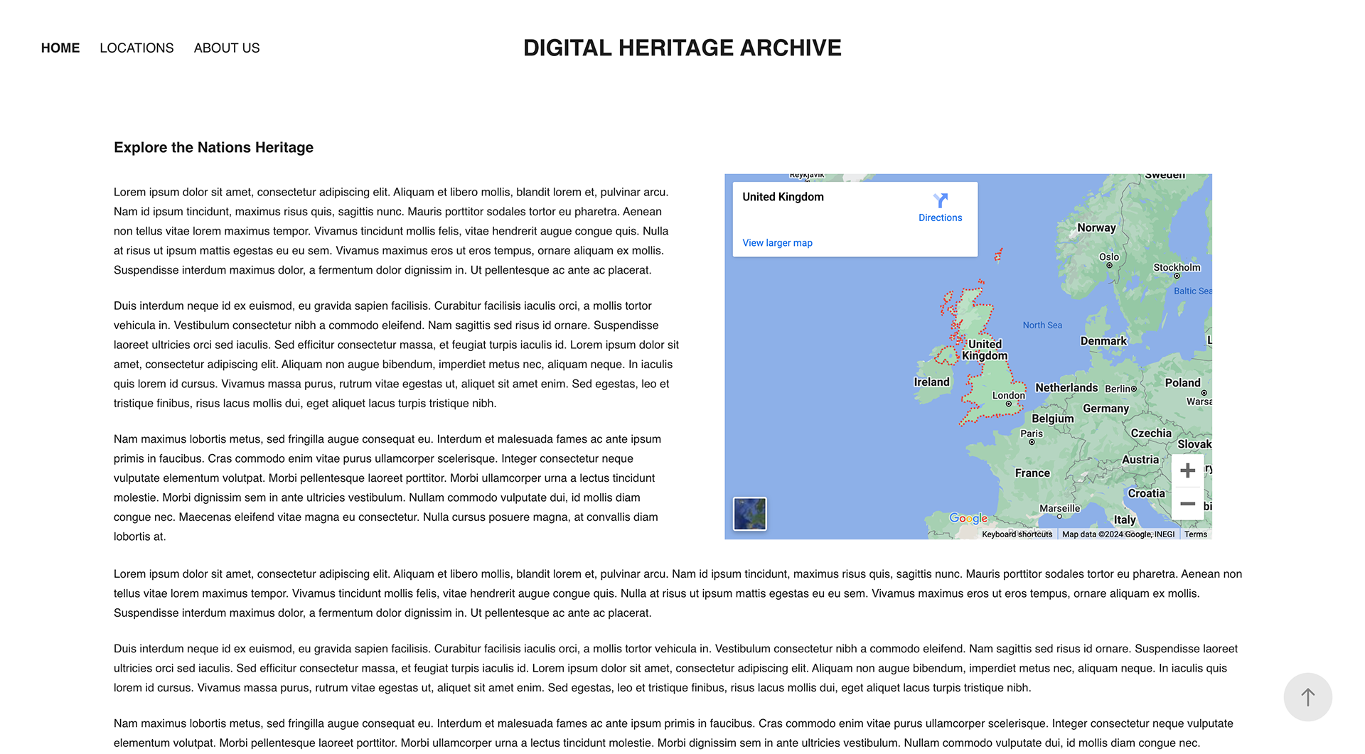

On the home page, you can see there's a map feature. To make the website interactive, I wanted to utilise Google's Map API to display topics with custom pins and info windows that provide summarised information.
On the Locations page, each city is represented by an iconic photo or landmark. When the website is fully operational, there will be hundreds of locations on this page.

Icon to show "Bombed Locations" around Bath.
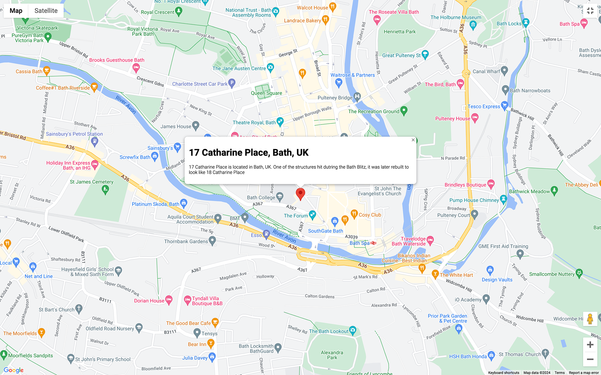
Example of an Info window without a custom pin.
Before diving into the historical topics of a particular city, there will be a page summarising some of the topics to give the reader context about the city they are exploring. On the topics page, they will be greeted with a variety of subjects to delve into, ranging from historical events to listed buildings.
The Google Maps API will be utilised on each topic page if there are locations that can be visited, allowing users to easily navigate to places that interest them.
Video example of the prototype.
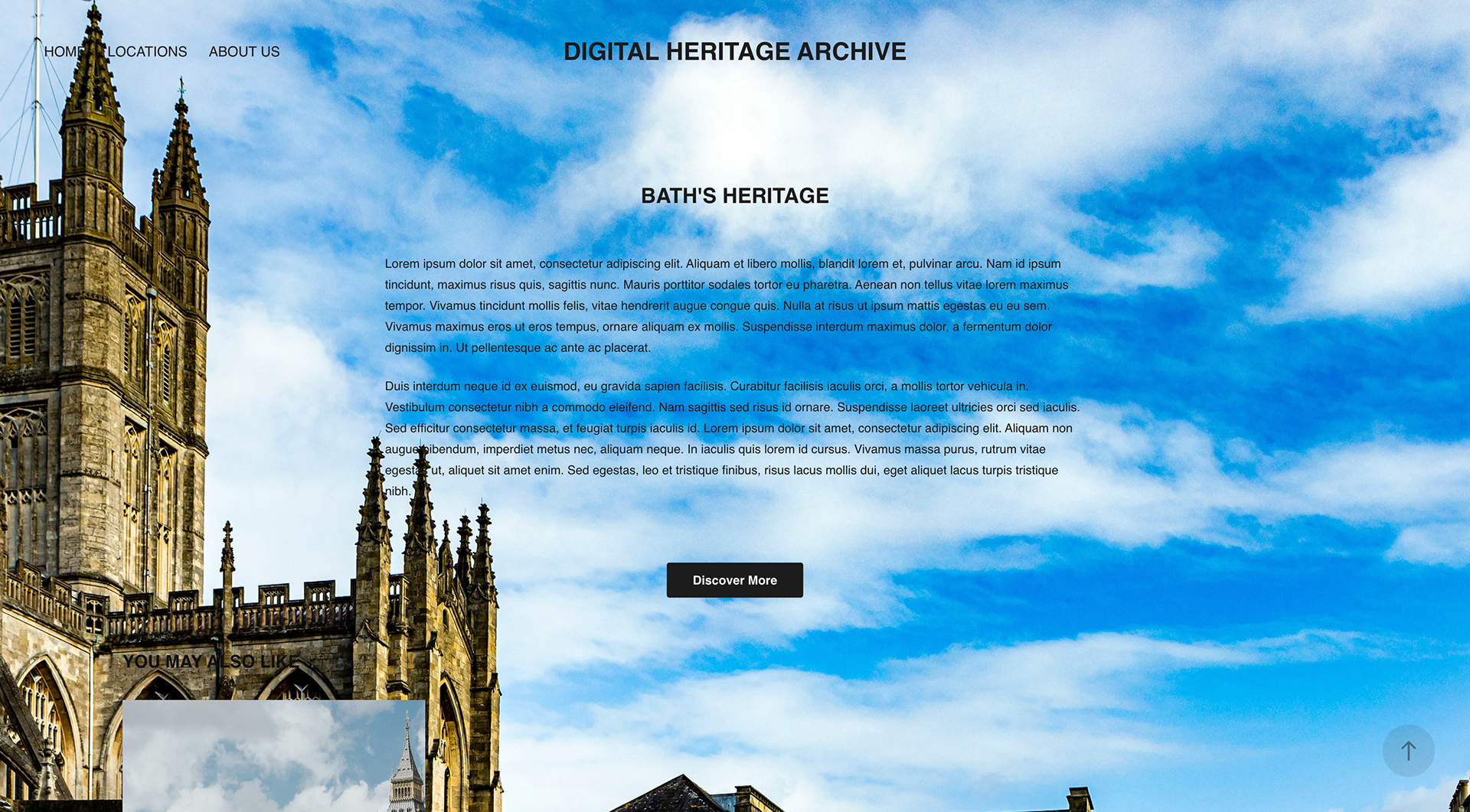
Home Page
On the developed website, the home page has a better sense of direction and structure. Users are welcomed with a full-width carousel. Beneath that is a summary of the DHA's goals, and just below that is a link to the About page where they can read more details.
There are two sections below that: a summarised location row and a topic row, each with a breakdown of how the navigation has been set up.


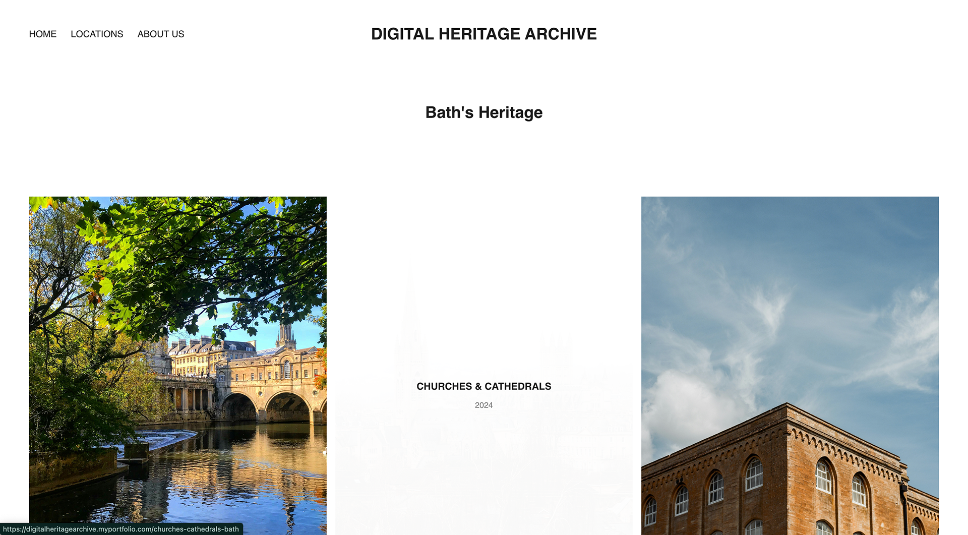
Locations & Topics
The Locations and Topics pages on the live site feature significant changes with improved UI, additional colours, and clearer labelling. Each location is labelled and features relevant imagery, along with an additional button.
On the Topics page, I have incorporated the colours from the brand identity into the imagery, text, and buttons to add vibrancy to the page.


Video example of the live website.